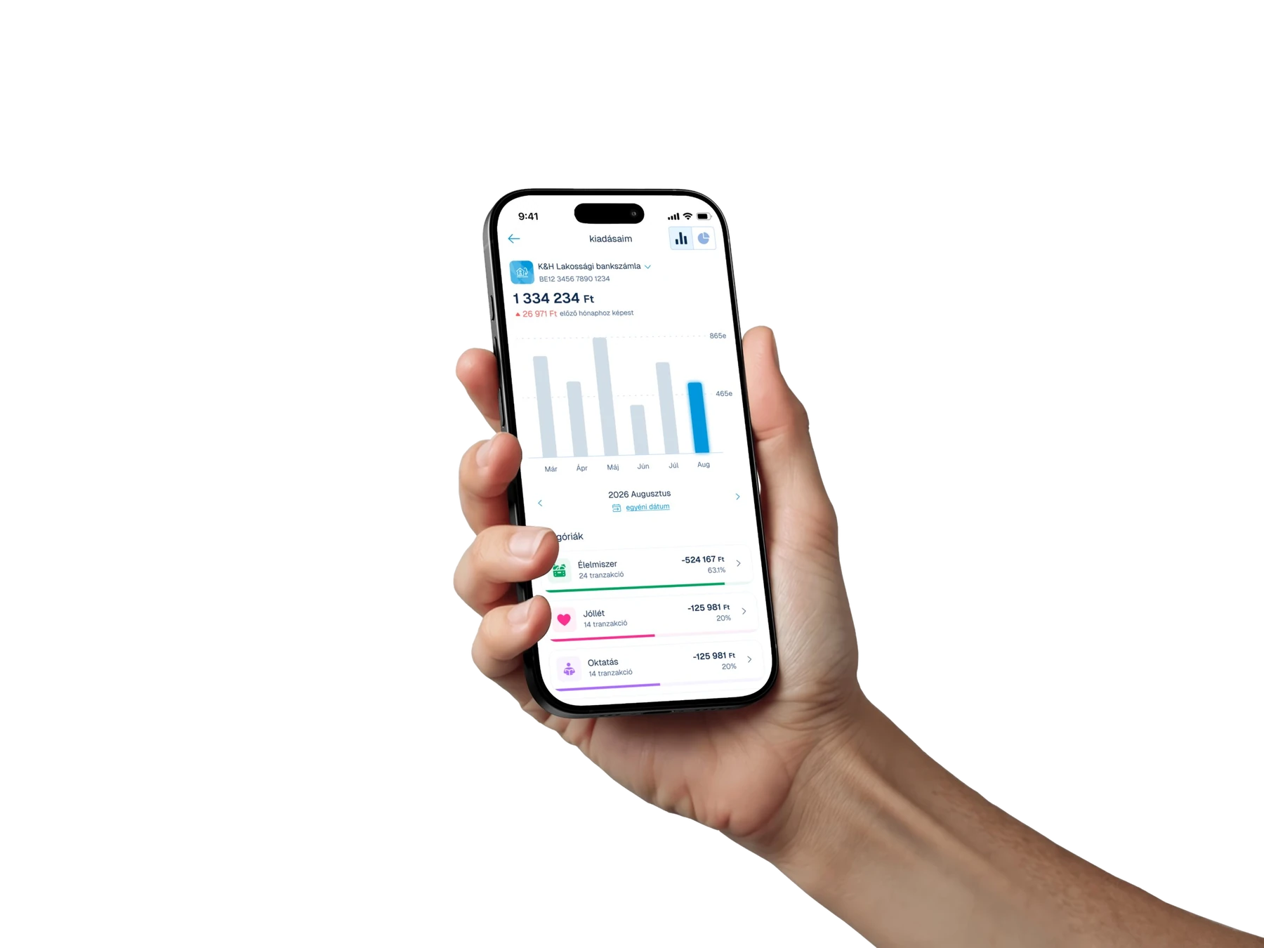
















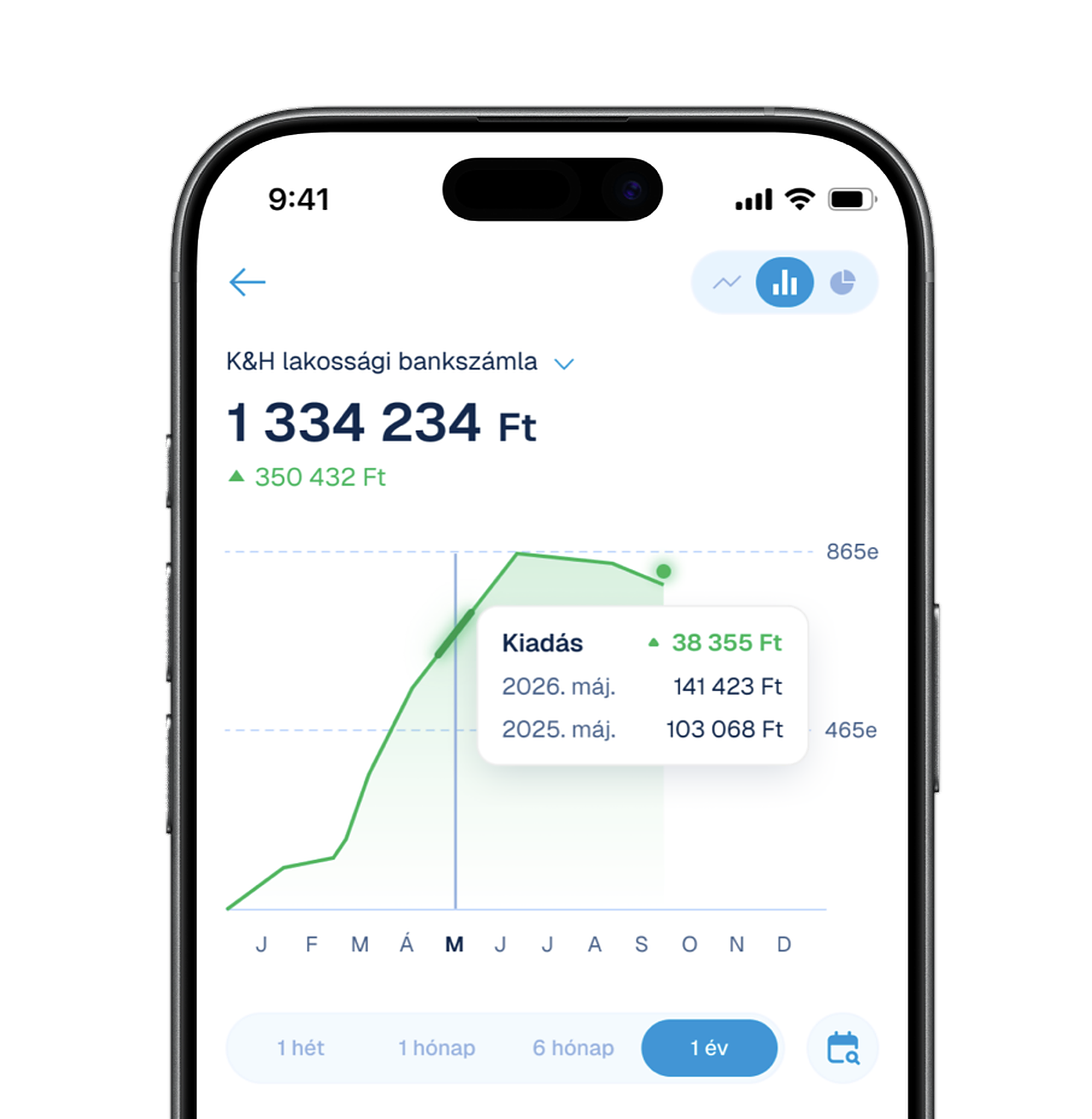






















An open card sort with seven mobile bank users, to rebuild the K&H app's menu and profile around the way people actually group and name things.
Challenge
The K&H mobile bank's menu and profile had grown item by item, and nobody was sure the structure still made sense to the people using it. Labels were written from the bank's side, related features sat in different places, and some entries were rarely found at all. We needed evidence of how customers think about these features before redesigning anything.
Approach
Seven moderated online sessions of 45–55 minutes each: a short interview about how people use the menu and profile, then an open card sort where participants grouped every menu item and named the groups themselves. With seven people we read the numbers as direction, not statistics — strong agreement (6–7 of 7) as a signal, 3–4 of 7 as a hypothesis.
Five stable groups
Across the seven sorts, five groups kept appearing: product settings, “me and my data”, contacting the bank, documents and paperwork, and messages. Product settings were grouped together by everyone; the rest by five or six of the seven.
Labels that mislead
Four labels didn't mean what people read into them, so the feature behind them stayed hidden. One entry confused every participant: nobody could tell it apart from its neighbour, and its real content fit none of the groups.
Recommendations
We turned the findings into a to-do list the team could act on directly, sorted by what to do with each item: remove, rename, move, merge or tidy up.